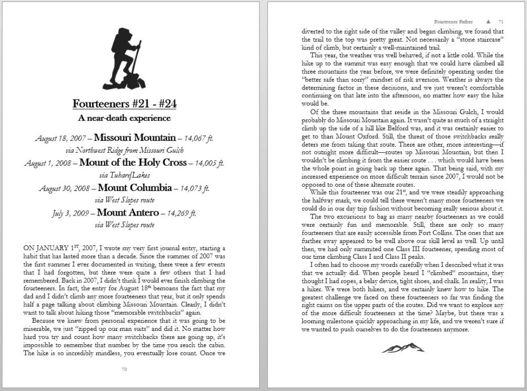
Go over to your bookshelf. Pick up your favorite book and open it up. What do you see? If your only answer is “words,” then take a second look. Flip through a few pages. Now, what do you see? Do you notice that it looks like a book? What do I mean by that? Essentially, all the other elements of page design—besides the words themselves—are what help make a book into what it is. That being said, I’ve seen some issues with self-published books that I feel I need to address.
Good design balances negative space.
Even though this post is mostly about the design of a book’s interior, the first place to start is with the words themselves. Open up your favorite book again and look at the words. Now, see where there are no words? The indents at the start of paragraphs and the chunks of space to the right of fast-paced dialogue create negative space that helps the reader proceed through the material. If you have a textbook on your bookshelf, open it up for comparison. While there are “walls of text” in a textbook, most will try to break them up with inserts and pictures to help make it more readable.
If you have a work-in-progress, open it up and compare it to these previous examples. Are all your paragraphs the same length? Are your paragraphs long sections of exposition? As children, we were all taught about writing in essay form. This means you have some similarly-sized paragraphs because each paragraph needs an intro, the content (what the text is about), and a transition into the next section. A 5th-grade essay will have five paragraphs of five sentences each. But you’re not writing a 5th-grade essay, are you? You’re writing creatively. These ingrained rules can be broken to create a sense of pacing and action, instead of a monotonous slog through a story. If your manuscript looks like a wall of text, break up your paragraphs a little more. Nothing intimidates a reader more than seeing a page with no natural breaks in it.
If your book doesn’t look like all the others, readers will notice.
We all know it’s important to proofread your book to make sure you caught all the typos in it. However, are you also finding all the formatting errors? While I know there are a lot of other word processors out there besides Microsoft Word, it behooves all self-published writers to understand how their word processor of choice works. Right now, I’m going through many submissions for a short story anthology, and I’m surprised how many of them don’t use the requested formatting. I want a document that’s double spaced, with first-line indents and no spaces after paragraphs. That shouldn’t be difficult, right?
Wrong.
I’ve seen people who “tab” the first line in their paragraphs, instead of using the already-built-in feature of a word processor to do that for them. I’ve even seen people use a whole bunch of spaces to create the same effect, which is more annoying to fix than you can imagine. While these techniques might work for self-publishing, consider how often you might miss indenting a paragraph, or if the indents don’t line up quite right when compared against each other. Readers are bound to notice this, just like how they’ll notice if an author uses Times New Roman, Arial, or some non-standard font that you wouldn’t usually see in a published work. They’ll see how unprofessional the formatting looks, and that’s what contributes to the negative stereotype of the self-published author.
To break this stereotype, we all need to hold our manuscripts to professional levels of formatting. If you need to hire someone to do the formatting for you, it’ll be money well spent. Plus, if you’re already proficient in professional formatting, then when you do finally submit to short story anthologies or agents/publishers, they’ll be more likely to accept your work based on its content because it won’t be nearly as much of a pain to fix it and get it ready for the printed page. With as many queries and submissions these people get, you don’t want something silly like formatting to be the reason for your rejection.
Page design is an art.
I understand that a lot of authors are publishing for the eBook market. Some of the formatting issues I mentioned above can hide when their files convert into a different file format. Similarly, it’s difficult to create a desired experience on the page when the font and font size can be changed by the reader. Despite all this, there are little additions that I think make a book more interesting to read, or at least make it interesting to flip through. And people will inevitably pick up a book and flip through it. I’m not sure what they’re looking for, but if you give them something that grabs their attention, they might stick around a little longer and actually read something.
Even for eBooks, a self-published author can add little pieces of art to help create an immersive experience for the reader. Instead of a couple of spaced lines between section breaks or a simple asterisk, why not use an asterism, fleuron, dingbat, or another symbol that can not only distinguish between sections of your chapters but can add some flair that’s tied to the theme of your book. Similarly, you can put similar ornamentation before the start of a chapter to help a reader quickly see at a glance how long your chapters are when they flip through your book.

Regarding font, I always recommend Garamond, since it is more professional than a standard Times New Roman typeface. Plus, if you look at any italicized text in Garamond, you’ll realize that it’s used more often than not. You can use a different font for emphasis occasionally, just don’t go overboard. Additionally, you might want to consider using a font for the page numbers and page headings that match the font you used for your front cover, just to tie everything together into a cohesive format. Heck, play with the placement of text in the headers and footers as well. Do you want page numbers on the top corners? How about the author name and title hiding in the margins? I’ve seen some creative uses of headers and footers lately that prove that page design is more of an art than most authors tend to consider.
With all this in mind, go back and take a look at your favorite book.
What kinds of formatting did they use?
Can you re-create some of this formatting for your manuscript?
What are some examples of interesting page design that you’ve seen in the books you’ve read?
